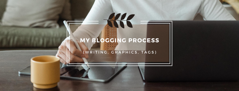
Hey girl hey. And boy.
I sometimes get emails on how I create my featured images and how I designed my web page and I keep forgetting to get back to them for some reason. So for those who emailed me about graphics and the writing process, this post is for you!
My blogging process is fairly simple but I thought I would share the software I use for my featured images, how I designed my site and a few tips and tricks for anyone starting out or wanting to enhance their blog. Without further ado, let’s get starteddd.
- Bullet Points
If you look back at my 2017 journal, you’d see that I wrote my entire posts and then typed them up but for some reason I sort of lost that ability throughout the years. Whenever I get a post idea, I will write down the bullet points of where I want to go to it but other than that, it’s a brain to word dump transfer. I tried to write down full posts but I realized that it actually took double the time than just typing it up so oop.
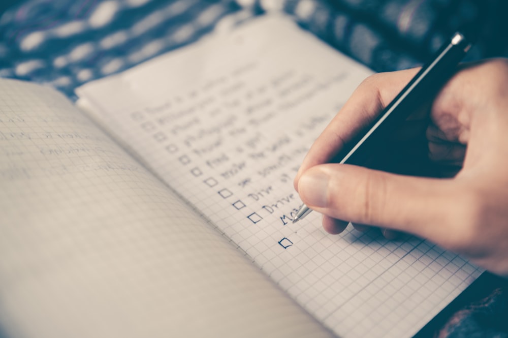
Do you write down your posts, write bullet notes or just type on the spot?
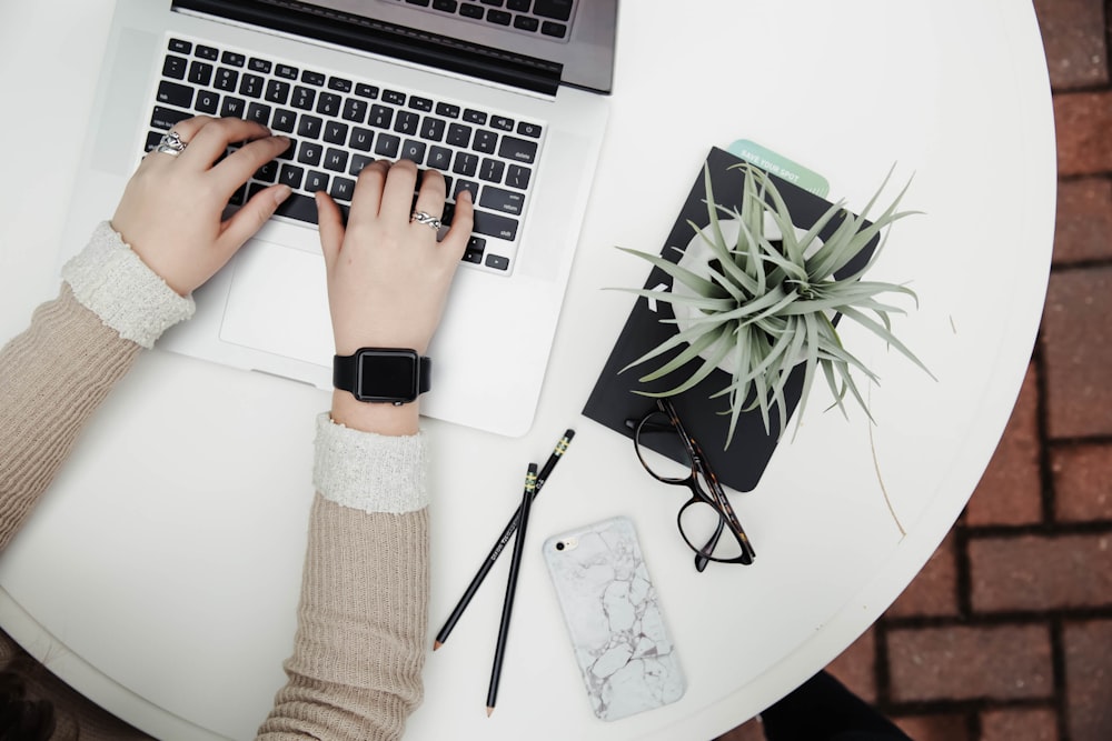
2. Typing it Up
This is fairly self explanatory but for some reason I write my introduction at the very end. It’s the same for essays too. Here, I will add photos and gifs under each point I mention as well as some emojis every now and then to make the text easier on the eyes. I used to use a million emojis but now I have like 1-3. I promise I’m happy, I’m just lazy lol.
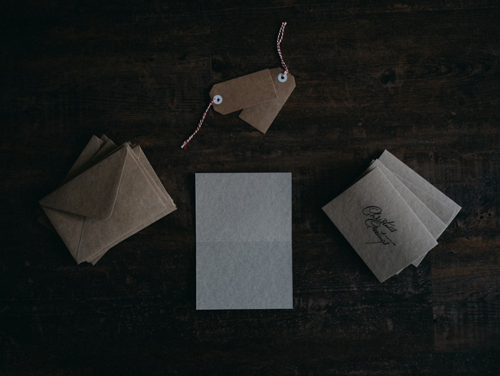
3. Categories and Tags
I don’t know about you but I have a gazillion categories. Almost everything goes under lifestyle or random and for tags, I just word my title differently. Also, whoever says that the more tags you have the better your exposure isn’t 100% right. My most popular post on Google has like 4 tags and the one that got it there was simply “first impressions” so it really depends on how rare the topic you’re talking about is.
4. Featured Image
I have a featured image for all my posts and I think it adds a great touch to your site. I have the Sela theme on WordPress so my featured images have to be on Desktop Wallpaper mode on Canva for it to fit perfectly. Canva is completely free to use and has so many great features on its site! I’ll walk you through a few here:
- Templates

In the top left corner, you can see all sorts of templates that you can just edit to suit your post. I rarely use these but the ones in Recently Used were super cute and I tweaked them to make my own featured images.
2. Uploading Images

Next up down the tabs are the option to upload your own images. I absolutely love this option because it just makes it so much easier to create your own photos and not have to buy any photos from the canva app because most of the good quality photos are photos that you really need for your thumbnail are not available for free so you could just download one from a website or take your own photos which is probably safer.
Recently I’ve actually been looking into how you could get sued for using copyright images from Google and how even the ones that I put into my posts sometimes delete themselves so you’re just kind of left with a thumb nail grid that doesn’t have any picture in it. I’m going to be more aware of that moving forward.
Definitely try to take your own photos when you can but definitely make use of those PNG images on Google and the royalty free images as well.
3. Photos on Canva

When it comes to individual images or PNG props for your thumbnail, canva can get pricy but they offer really beautiful wallpaper photos for free in their photo section. I literally just discovered this so I’m learning along with you too!
4. Grids

Under elements, you have the option to make collages for free which is super handy especially for my Expectation vs Reality cover photos, DIY’s and recipes!
5. Frames
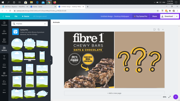
You also have the option to make different frames for your photos and you will see me use the circle one very often but the blob, square and device ones are also neat!
6. Gradients

These are such a beautiful edition to your cover photos and I definitely recommend them! Here are some cover photos I did experimenting around with them:


7. Illustrations

These are so aesthetic I looove! Whenever they fit in my cover photos I would add them.
8. Text

Moving away from elements now, you have the Title component which gives you templates as well as just making your own. I LOVE the cold smooth and tasty template and wild sale. My favourite font would have to be Playlist Script though.
9. My theme process.
In the following images you will see how I make my featured images now. All I did was add a one image grid behind the text. Added a square behind the text using shapes from Elements and added a simple illustration around the frame accent.

Next, I make the transparency around 34 and sometimes to 0 depending on the background colour.

After filling in my photo that I chose from Canva photos, I will change my translucent square colour to one that matches the photo. I love that Canva identifies the background colours for you and just makes the process so much easier!
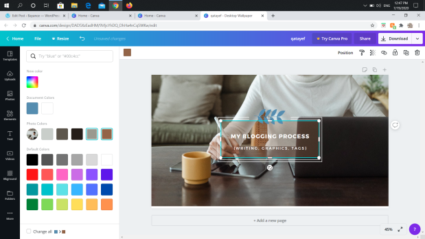
Finally, I will export it as a PNG file just because it’s suggested (it doesn’t make it transparent) and set it as my featured image!

And voila!
5. My Website Design
I’ve been experimenting with my website design for so long and I like to change it up every season. I’ll walk you through some of the features that my free theme ‘Sela’ has and how I made my header image on canva.
Header Image

So my header image was super easy to insert but as you can see, my theme crops out a lot of it so I really had to experiment with the size until I made the text small enough to fit. I do a lot of digging for my photos and I absolutely love that lilac tree. I used to struggle with finding a background that made way for my site title but now I discovered that you don’t need to display your site title or slogan. So I just pasted them onto the image itself and I was able to use any photo I wanted with a shape behind it so that the text is clear! If you have any more questions about this process, please let me know. And as always, I found this on Canva.
Site Icon

I personally don’t display a logo on my site but I do display a Site Icon. I think a Site Icon is super important because it shows next to your website, on your Reader’s and so much more. I made mine using the logo feature on Canva and it’s super simple so let me walk you through:


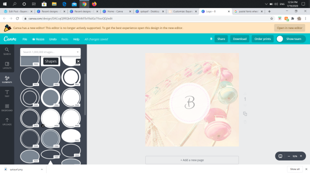
That’s legitimately all I did. An image with a circle from elements and a B on top. Bam. It’s super simple!
Fonts

My font is currently on Karla and Arimo which basically just makes my headings uppercase and my text lowercase. I think it’s nice that way and your font should definitely be light on the eyes. If it’s some weird fancy writing for your base font, people will struggle reading it. And avoid adding too much colour as it can be overwhelming!
Colours and Backgrounds
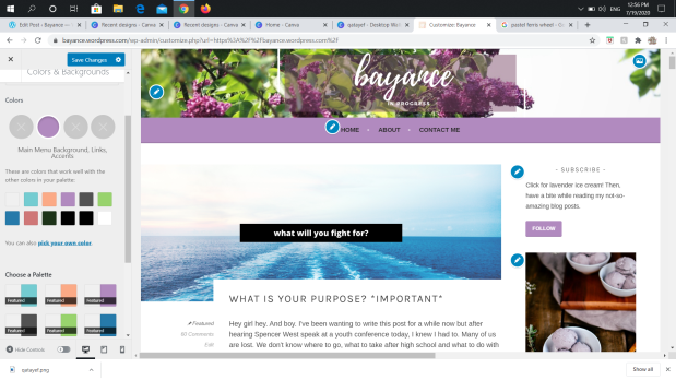

For colours and backgrounds, I don’t really like to change my background photo (i just leave it grey) but instead I like to change my palette to match my header image. In the new wordpress update, they let you choose any colour you want which is crazy because when I was blogging all this time, we just had to choose between 6 colours!
Main Sidebar
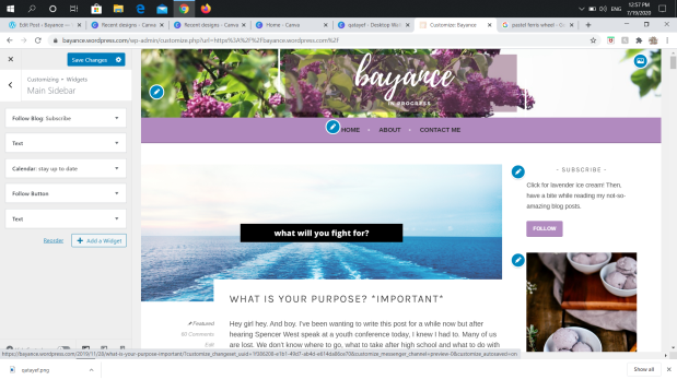
The main sidebar adds such a nice piece to your website so definitely utilize it. I have a subscribe button for anyone who wants to get my posts in their email. And of course, I always like to bribe with free food that matches my theme every season haha. Also, confidence issues when I say “not so amazing”? Lol I wrote this ages ago but we’ll leave it there for a Dork Diaries effect. Also, I added in the ice cream photo by pasting it into the text option. Under that, I have a calendar, follow button and another photo of a plant.
Blog Display

Finally, these are my settings for Content. I like to display my featured images everywhere. And OH post excerpt is so so important because I know that when I click on a website and it shows the FULL post, it can get overwhelming. So unless you intentionally want your posts shown fully, I do recommend just having a ‘read more’ option so people can see what type of posts you’re writing rather than one huge one in their face.
Menu (home, about me, contact…)
I finally figured out how to add menu options so more things instead of Home, About Me and Contact Me. So I’ll show you how to do that now but I personally don’t do it as I just have a million categories haha. I might edit my site now to maybe list my favourite categories? We’ll see.


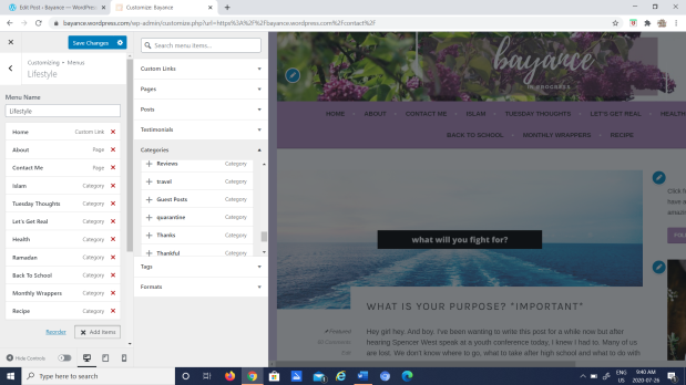

I hope you were able to make sense of the pictures but all I did was go to Menus then press on my original menu (don’t add a new menu) and finally add items which in my case were categories. At first I wanted to show so many categories. But I edited the Islam posts to work with Let’s Get Real because usually I’m talking about something deep or meaningful in those posts. I left Ramadan as its own category because I just love Ramadan posts and they’re a bit more light hearted than my Islam category. And the rest of the categories I just really enjoy. So now you can head onto my blog anytime and read JUST my monthly wrappers or JUST my Ramadan posts which is nice instead of digging haha.
Anddd that’s all for today.
I really hope you enjoyed today’s post. It was fairly long but I hope it helped anyone looking to redesign their blog or look at a new theme. Thank you all so much for reading and mark your calendars for a very important post this Thursday, June 30 2020.
I’ll see you on Thursday.
Bayyy. 💞

Love this so much Bay! I feel like everyone has their own blogging system that maybe works for them and maybe needs changing and everyone just does it so differently! 😂 It’s pretty narrow minded but I used to just think that everyone blogged how I did but it’s so not true, we all do everything differently 😌 I do love re-designing my blog to a new design but I also find it a lot of effort? At the moment I’m loving my own design so it most likely will stay like that for a while 😂 What a good idea bullet pointing! I usually just go straight in and start writing but that seems like a really smart idea to collect your thoughts ❤️ Thanks for sharing this lovely post Bay and hoe you’re doing okay! 🙂
LikeLiked by 1 person
Sis I loveee your website design!! Loool I honestly thought so too. Honestly it differs on the type of post like the more ranty ones I might just dive in haha. Tysmmm for reading and you tooo ❤
LikeLiked by 1 person
Thank you so much Bay! 🥰 That means a lot. I totally agree, I sometimes do a structured post but usually I just dive in there and release all my crazy thoughts, of course, it was a pleasure reading! ❤️
LikeLiked by 1 person
This was such an interesting read! I love these types of posts where you’re given an insight into what goes on behind the blog as people often forget how difficult it can be to maintain. Really like how you’ve gone into depth on each subject and let us in on all that. Is cool to see things from another bloggers perspective 💫 You put a lot into it and your hard work pays off! 🙌 Looking forward to reading that exciting post you speak of! 😯✨ Great post, take care 💕
LikeLiked by 1 person
Thank you so much! So trueee. My pleasure. Ahhh tysm ❤ Thank you so much for reading and haha be on the lookout. Tysm and you as well ❤
LikeLiked by 1 person
Canva really is so helpful with everything!
LikeLiked by 1 person
So true!!
LikeLike
Love it! I KNOW IT HAS BEEN SO. FREAKING. LONG. AND I am so so sorry but IM HOPEFULLY BACK. And for real, your web design has me quaking in my boots. It’s absolutely gorgeous, like you <33
LikeLiked by 1 person
Siiiiis I miss youuu! That’s amazing I’m so glad. And omg hahaha tysmmm! Ahhh no way thank youuu 💗
LikeLiked by 1 person
i missss you too omw ❤ and it's just the truth, it's great seeing you again and seeing how far you've come! xo
LikeLike